
Brand Design Project
ZENTO – Zodiac-Based Supplement Company
Project Overview
ZENTO is a Taiwanese supplement brand that offers 12 unique health blends, each aligned with one of the 十二地支(子丑寅卯辰巳午未申酉戌亥) in the Chinese zodiac. The founder's vision was to create a brand that reflects the harmony of traditional Eastern philosophy with a modern, premium aesthetic.
My Role
-
Brand Identity Design (Logo System)
-
Packaging Design (Stick packs & Outer boxes)
-
Print Production Supervision
-
Client Communication & Iteration
-
AI Concept Art Direction (via ComfyUI)
Design Process
1. Client Discovery & Vision Alignment
The project began with in-depth discussions to uncover the client’s core brand values and visual ambitions. A key directive was to integrate the 十二地支 (12 Earthly Branches) not just as decoration but as the structural foundation of the identity.
2. Generative Style Exploration (AI + Art Direction)
Using ComfyUI, I guided the client through a generative concept exploration phase. These AI-generated visuals helped us establish the brand’s visual tone — blending futurism with traditional energy — and allowed for faster alignment before entering manual design refinement.

AI Generated
3. Logo Development & Iteration
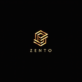
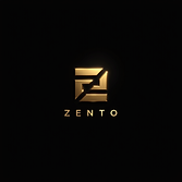
The logo consists of a dual hexagon motif where the internal "Z" represents ZENTO and the outer hexagon reflects the cyclical flow of time and energy—symbolizing the 12 Earthly Branches. The geometry and angles were intentionally aligned to echo the spiritual structure behind the traditional timekeeping system.
-
Inner Hexagon – Unified product system
-
Outer Hexagon – Divided into 12 directions, representing each zodiac
-
Color Palette – Gold on black conveys luxury, trust, and tradition
Initial concepts were generated using ComfyUI to explore direction and mood. Once approved, I moved into Adobe Illustrator to produce high-fidelity variations, with extensive feedback and refinements from the client.


Finalized Logo
4. Packaging Design & Print Execution
The packaging system was designed to distinguish each product while keeping consistent brand structure.
-
Each product features one zodiac character as the focal point (“子”, “丑”, etc.) with custom color themes for quick recognition.
-
A dynamic ink-brush splash motif connects the modern form with calligraphic tradition.
-
I created production-ready dielines and Pantone specs in Illustrator for stick packs (37×160mm, 25mL) and external boxes.
-
On-site print supervision was conducted at the manufacturing factory to ensure color fidelity and foil quality, especially for the specified Pantone 273 C, 127 C, 7403 C, and 466 C.
Additionally, I built high-quality AI mockups for product visualization, marketing preview, and vendor handoff.


5. Brand Application & Collateral
To complete the brand system, I designed:
-
Business cards reflecting the premium identity
-
A consistent color and typography system for future product expansion
-
Digital and print-ready assets aligned with ZENTO’s evolving product line

Outcome
The final branding for ZENTO elegantly fuses traditional Chinese symbolism with a modern brand architecture. From logo to packaging, the system reflects balance, time, and well-being — perfectly aligned with the client’s vision to deliver wellness products grounded in ancient wisdom and contemporary aesthetics.